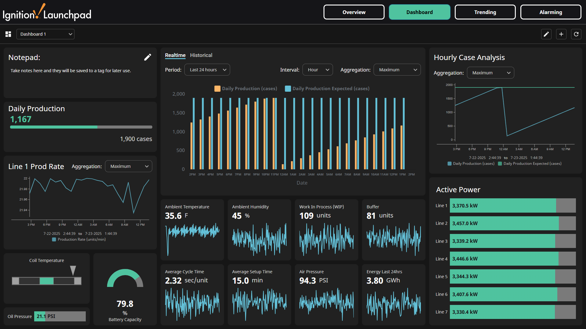
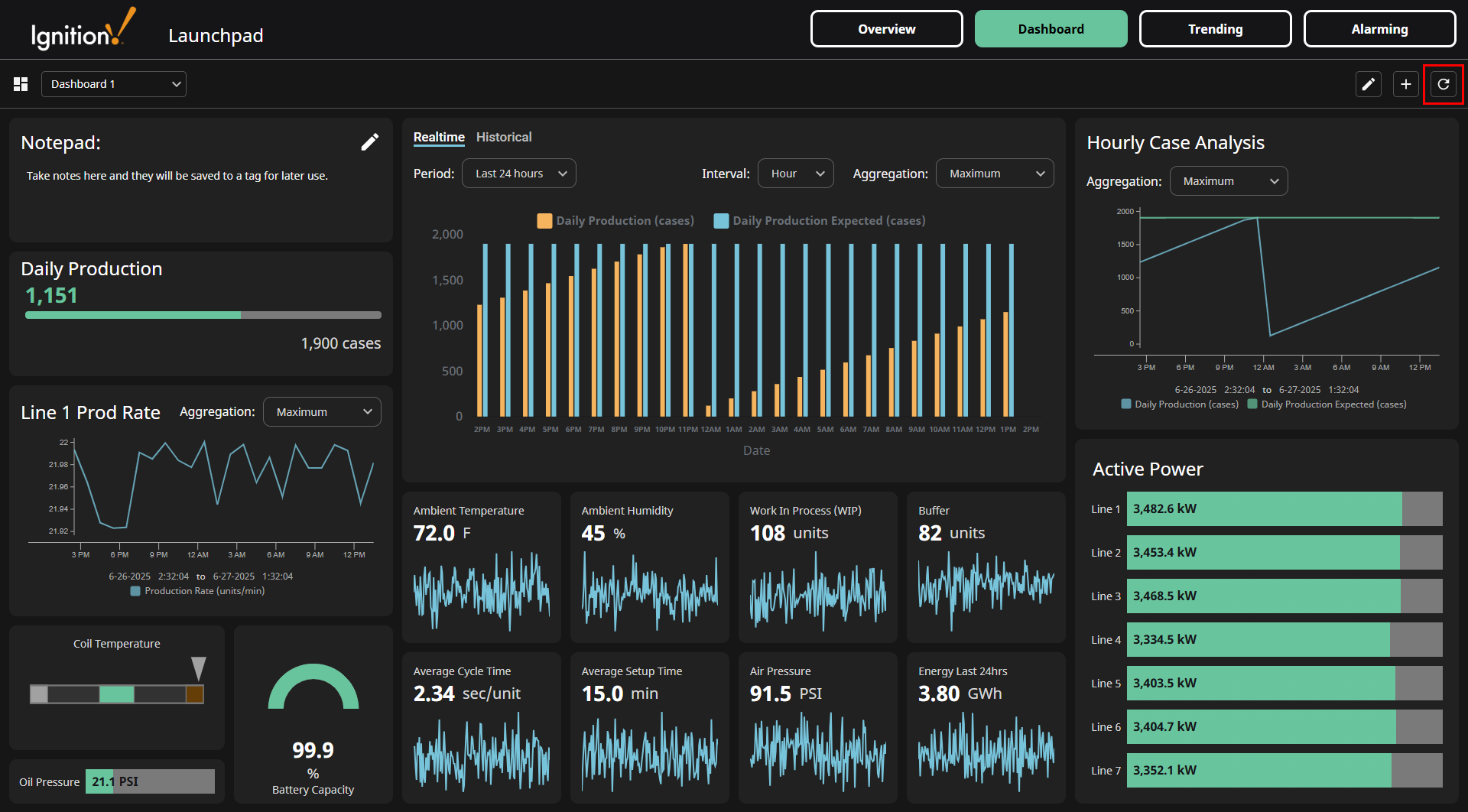
Dashboard
The Dashboard screen utilizes the Dashboard component, which exposes layout capabilities in a Perspective Session so users have the ability to build custom dashboards for their individual needs.
Dashboard Header Actions
Add Dashboard
To add a new dashboard, click the Add dashboard  icon on the upper right of the screen.

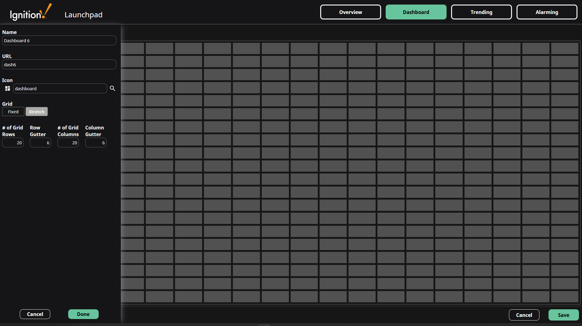
Clicking the Add dashboard icon will open the dashboard editor. Configure the settings for the dashboard by using the side panel. Refer to the Dashboard Settings section for settings descriptions.
After configuring the dashboard settings, click the Done button at the bottom of the side panel. Widgets can now be added to the new dashboard. Refer to the Component Actions section for instructions on adding, configuring, and deleting widgets. Once widget configuration is complete, click the Save button on the bottom right.
Edit Dashboard
To edit the current dashboard, click the Edit current dashboard  icon on the upper right of the screen.
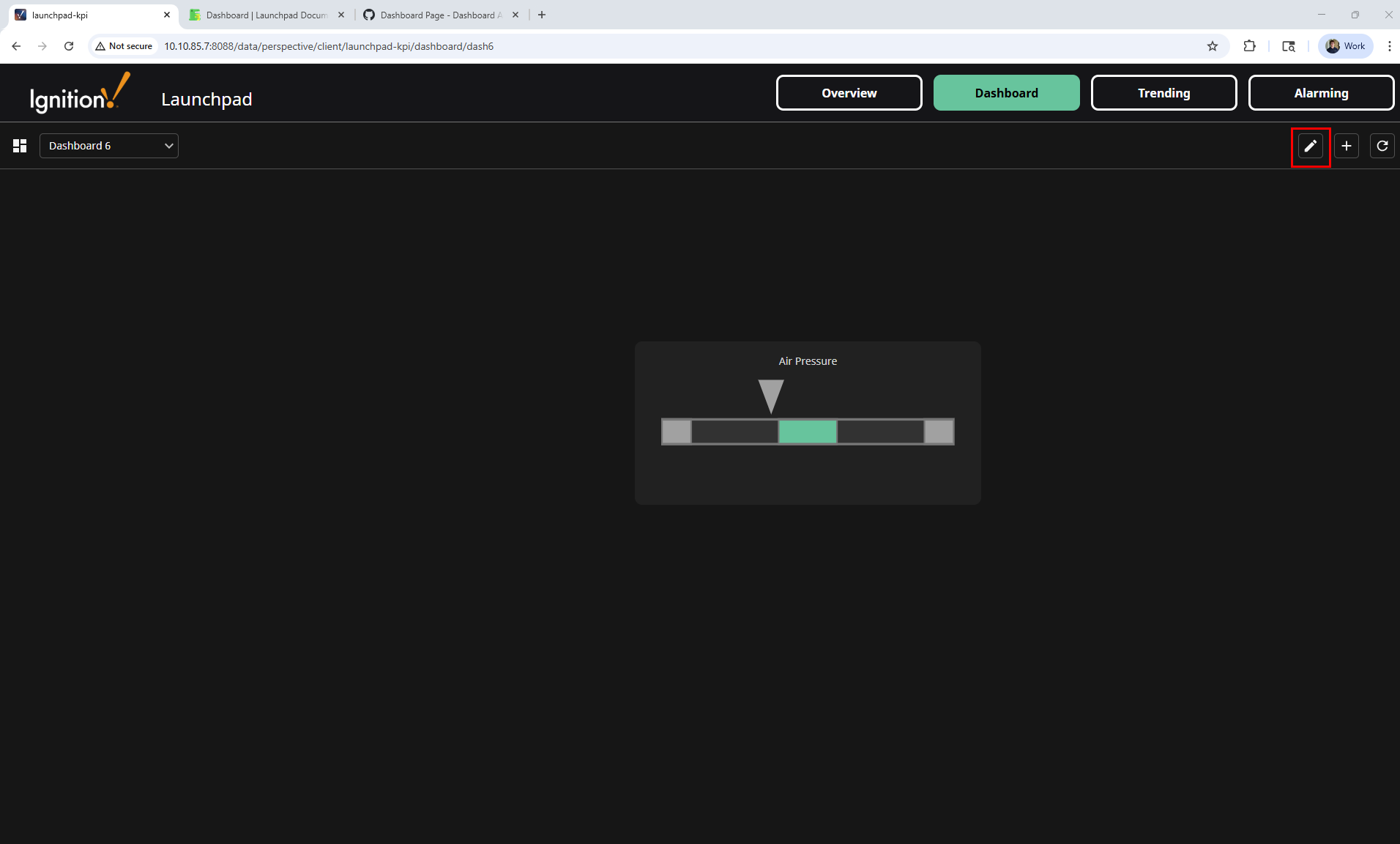
Clicking the Edit current dashboard icon opens the dashboard editor. The Dashboard settings can be accessed by clicking Edit Details. Refer to the Dashboard Settings section for settings descriptions.
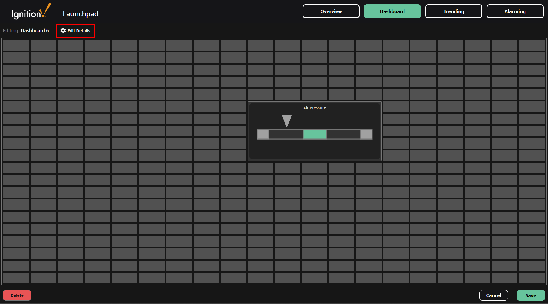
Refer to the Component Actions section for instructions on adding, configuring, and deleting widgets.
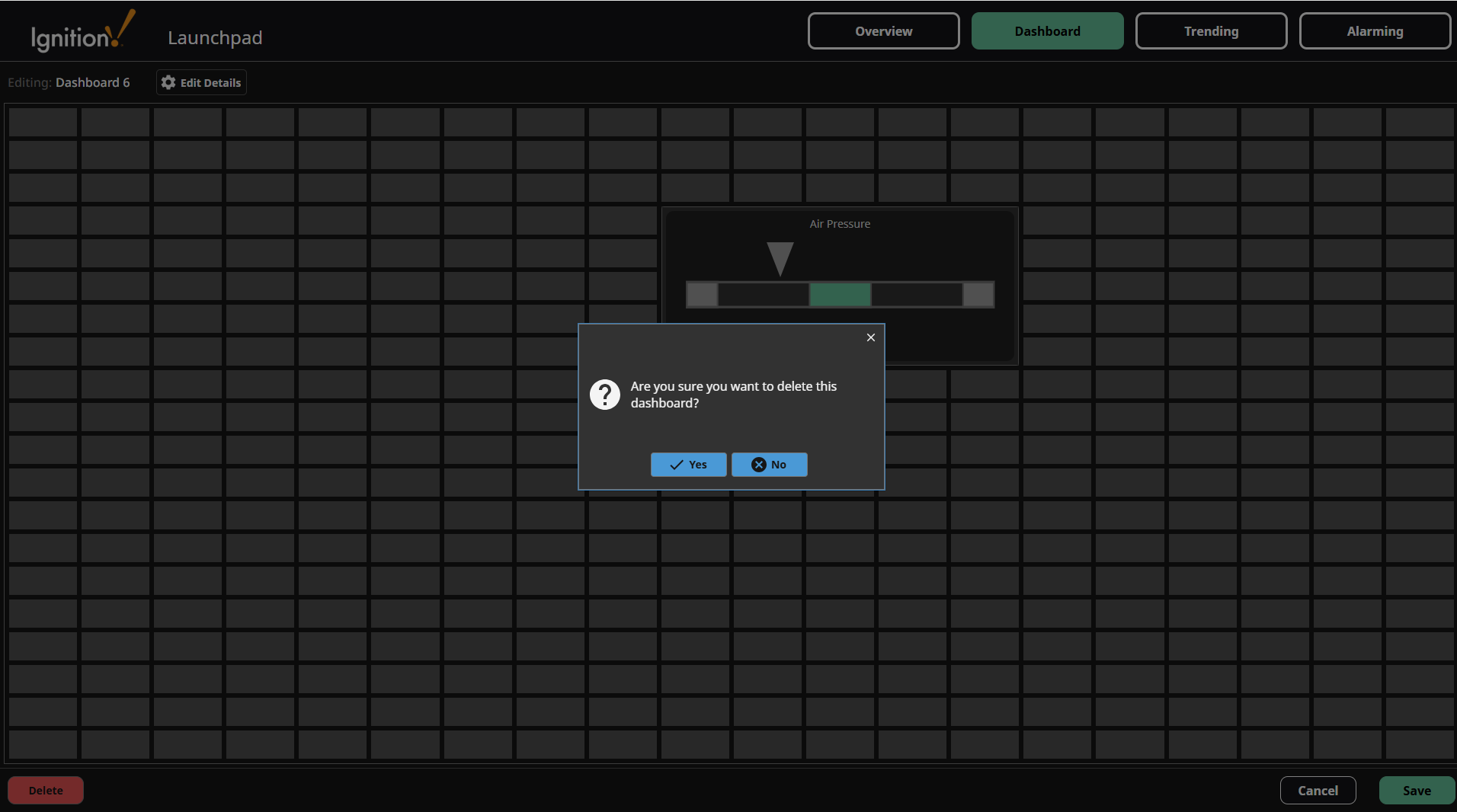
Delete Dashboard
To delete the current dashboard, click the Edit current dashboard icon on the upper right of the screen.
Click the Delete button on the bottom right of the dashboard editor.
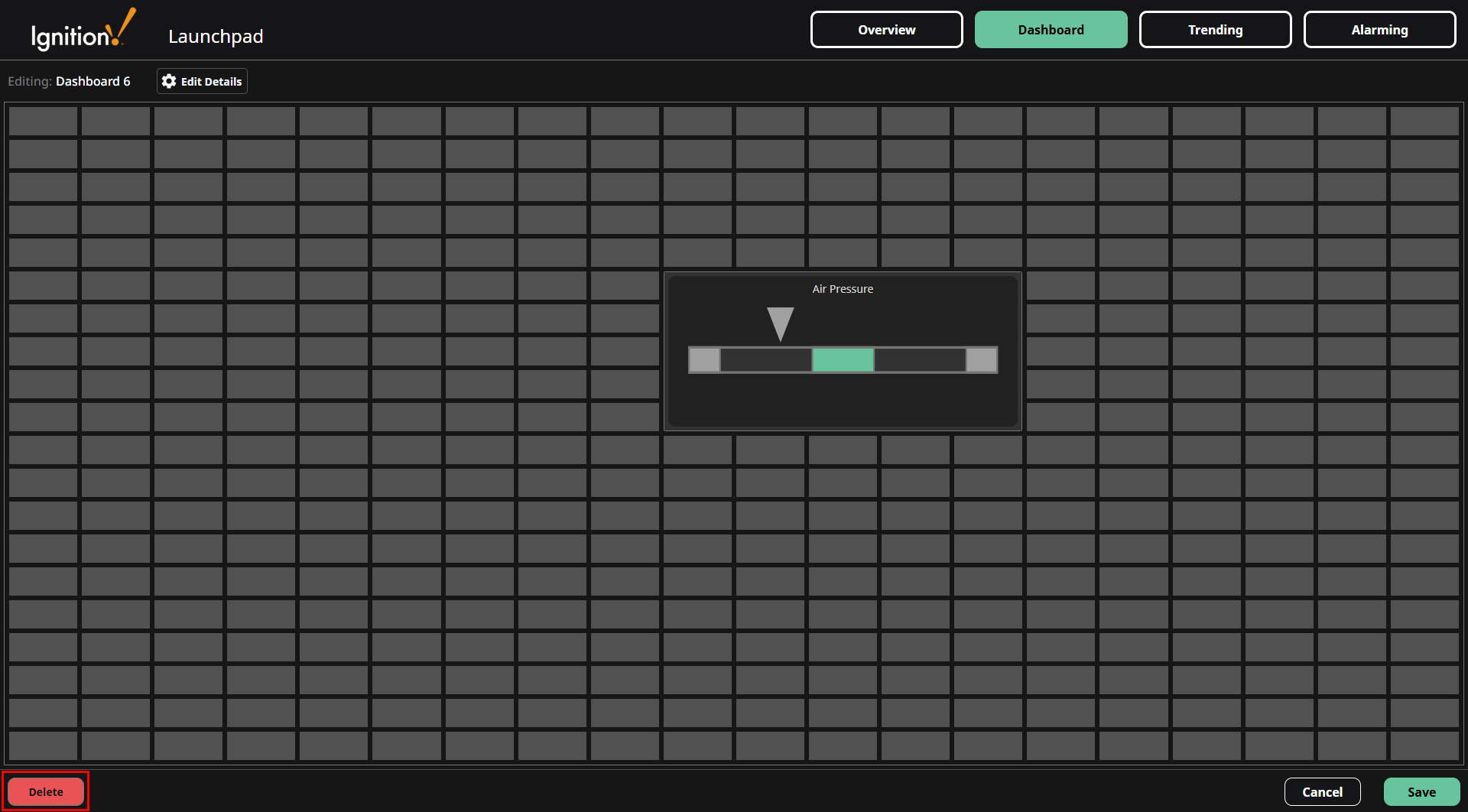
Confirm the dashboard deletion.
Refresh Dashboards List
Clicking the Refresh  icon will update the Dashboard to reflect any configuration changes made by other users.
Dashboard Settings
- Name: Name of the dashboard.
- URL: URL of the dashboard. For example, with a URL set to
dash6, the dashboard can be accessed by going to:http://gatewayAddress:gatewayPort/data/perspective/client/launchpad-kpi/dashboard/dash6. - Icon: Icon of the dashboard on the upper left of the Dashboard screen. (to the left of the Dashboard Dropdown).
- Grid: Grid layout mode of the dashboard. It can be fixed or stretch. More information about fixed vs stretch can be found here.
- # of Grid Rows: The number of rows in the grid.
- Row Gutter: The gap size between grid rows.
- # of Grid Columns: The number of columns in the grid.
- Column Gutter: The gap size between grid columns.
- Cell Size: The width and height of a grid cell. This setting is only available when the Grid mode is set to Fixed.
Component Actions
Adding a Component
-
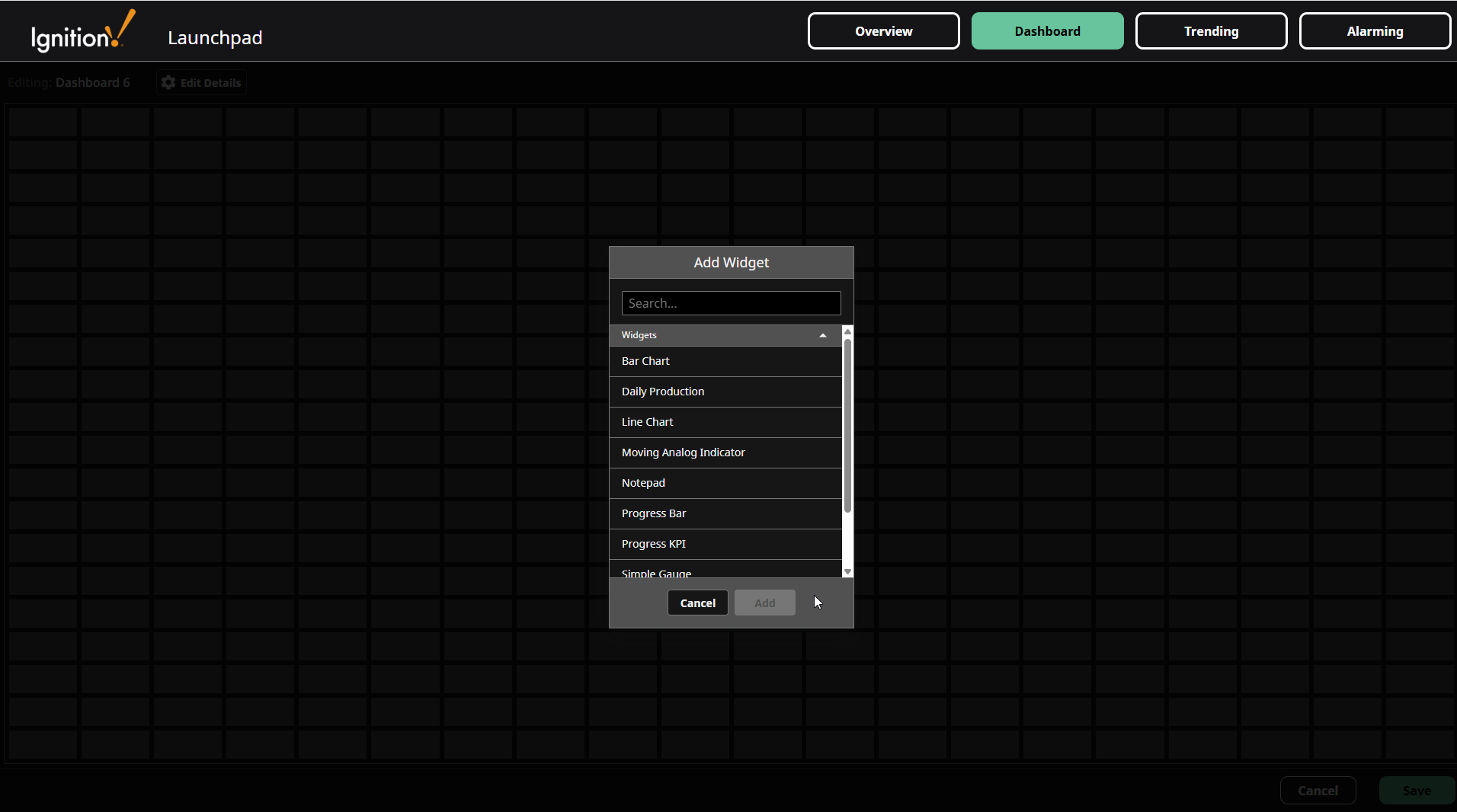
To add a component to the dashboard, click on one of the cells in the dashboard grid.
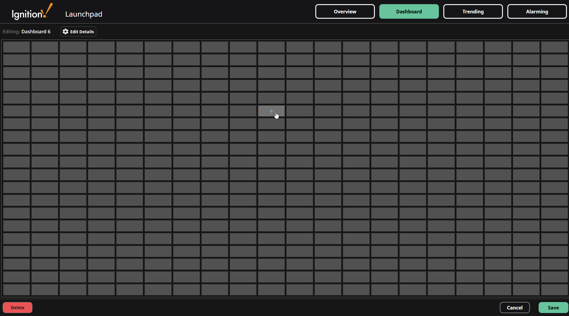
-
A popup for selecting a component will open. Select a component from the popup.
-
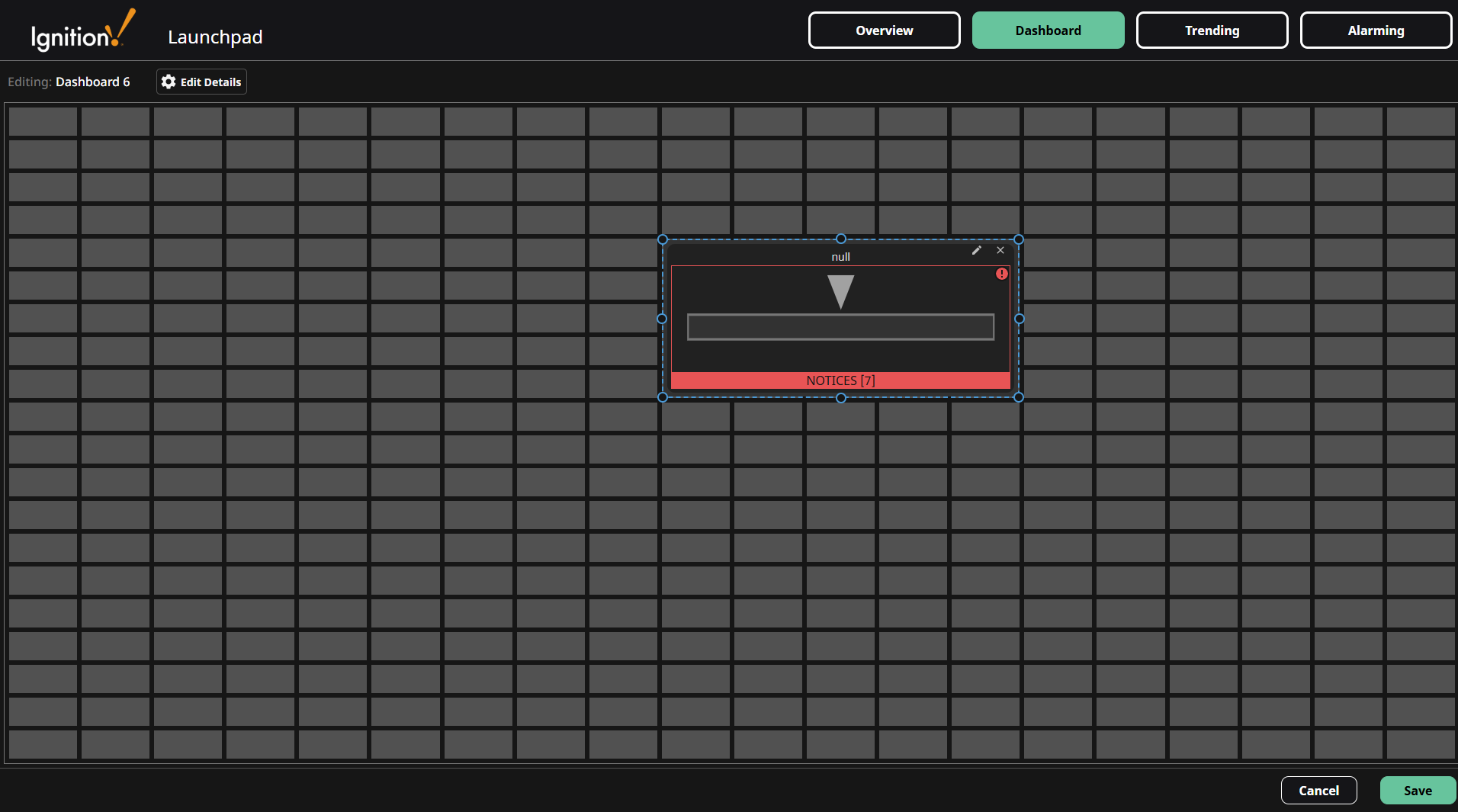
After selecting a component to add, a new component instance is now displayed in the grid.
-
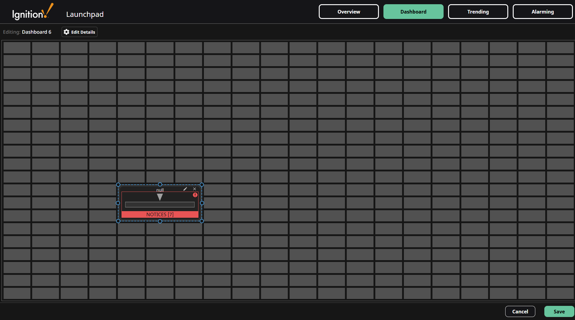
Clicking the new component instance reveals resizing handles for adjusting its size, and it can be dragged to reposition.
Configuring a Component
-
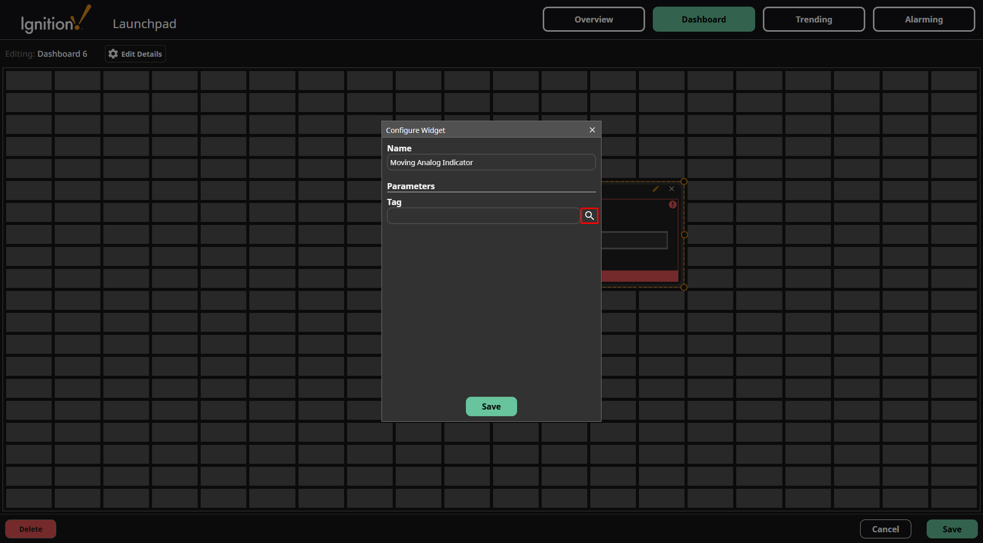
To configure the component settings, click the component to reveal the Edit
 icon and Delete
  icon, then click the Edit icon.
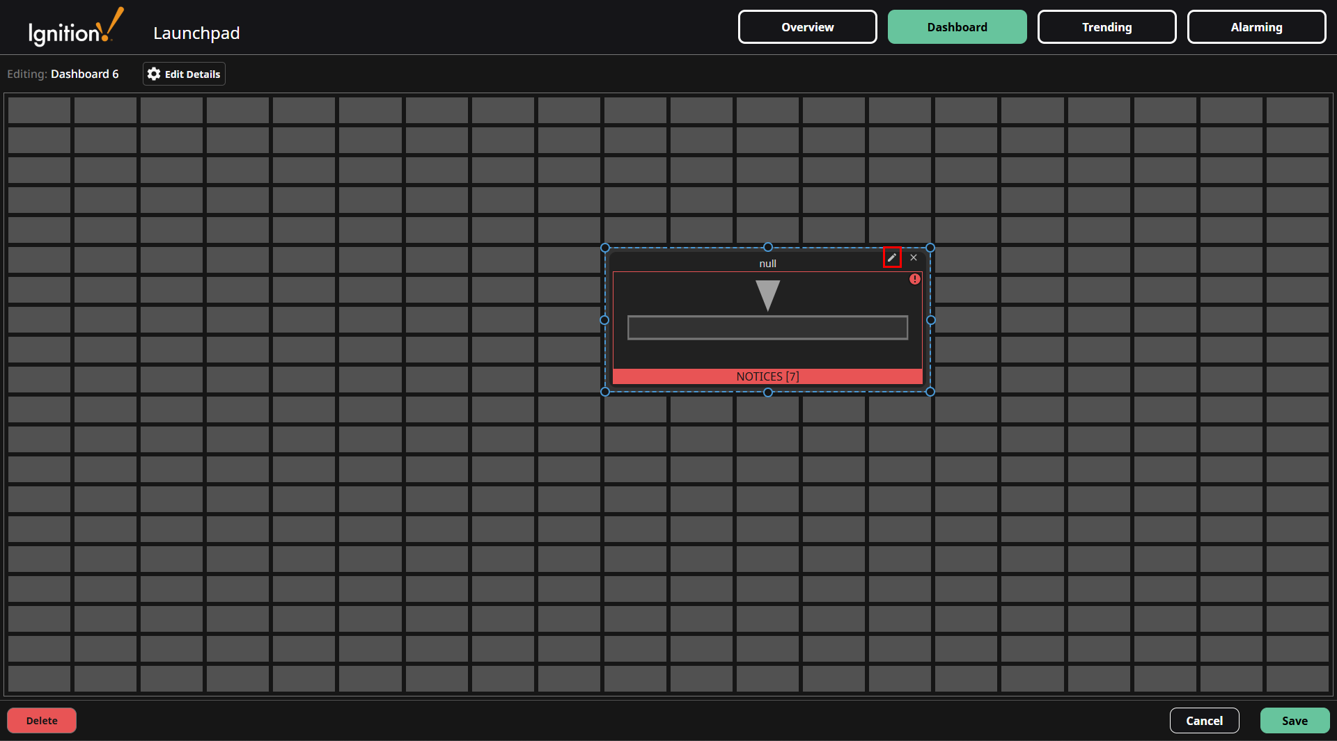
-
The Configure Widget popup now displays the component Name and Parameters settings. Enter your desired name and tag path in the corresponding fields. You can also use the Search button to select a tag from the tag tree to pass in the necessary tag path.
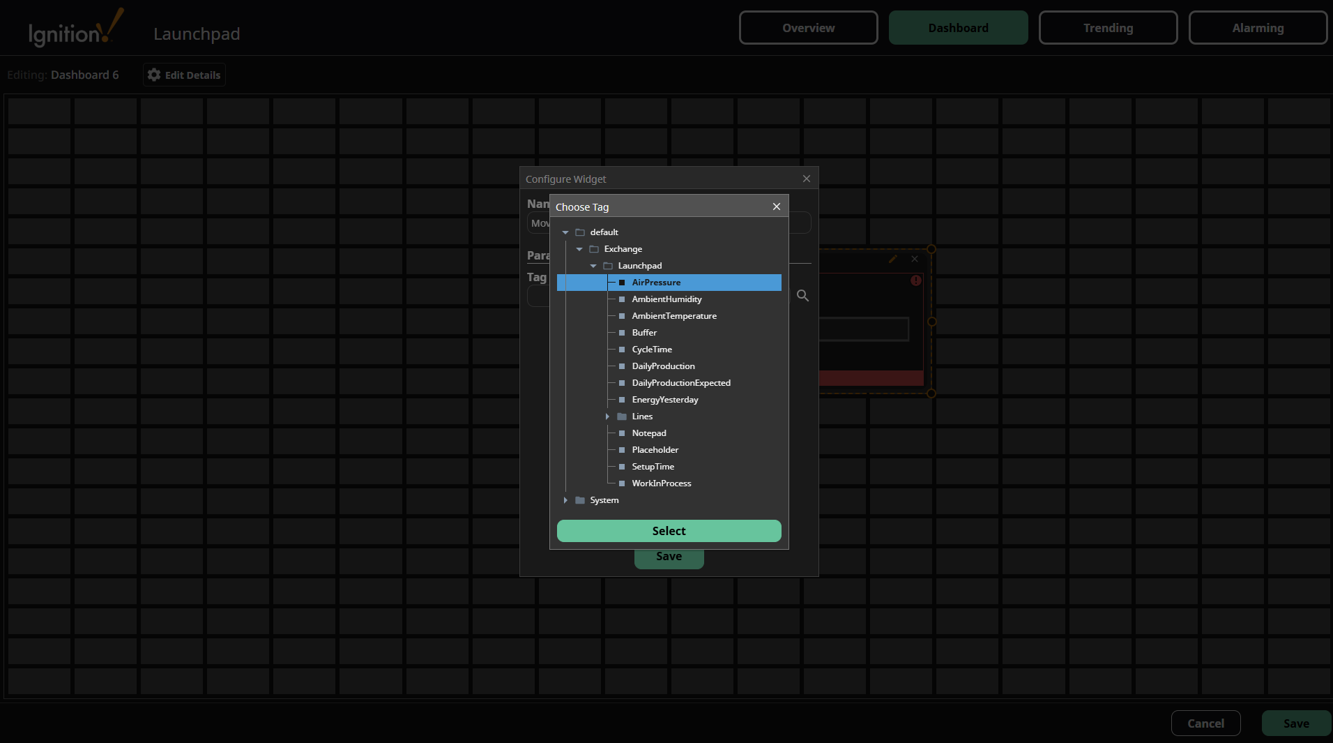
-
After selecting a tag, click the Select button at the bottom of the Choose Tag popup.
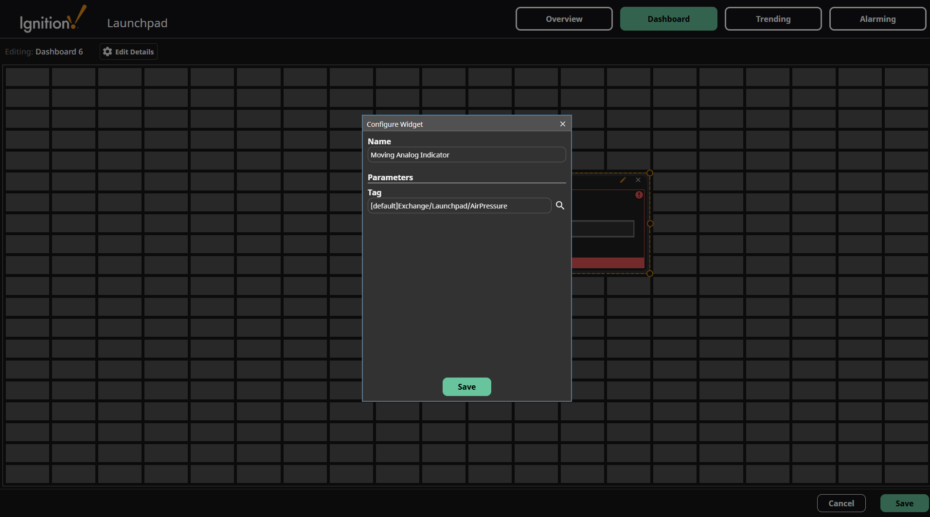
-
After setting the widget name and parameters, click the Save button in the popup to save the component settings.
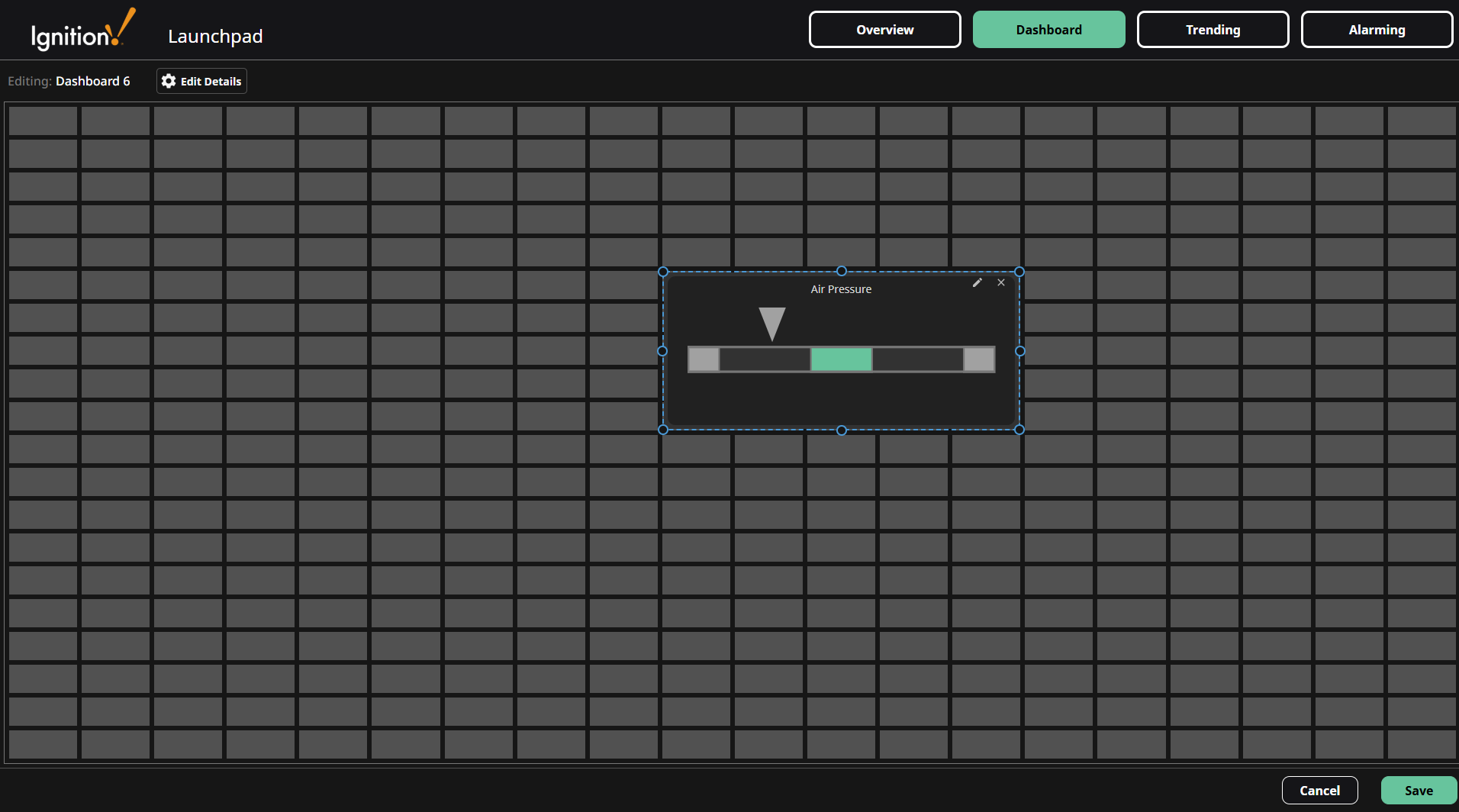
The saved component is now displayed in the Dashboard grid.
Deleting a Component
-
To delete a component, click it to reveal the Edit
icon and Delete icon, then click the Delete icon.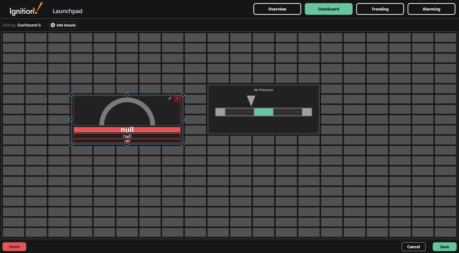
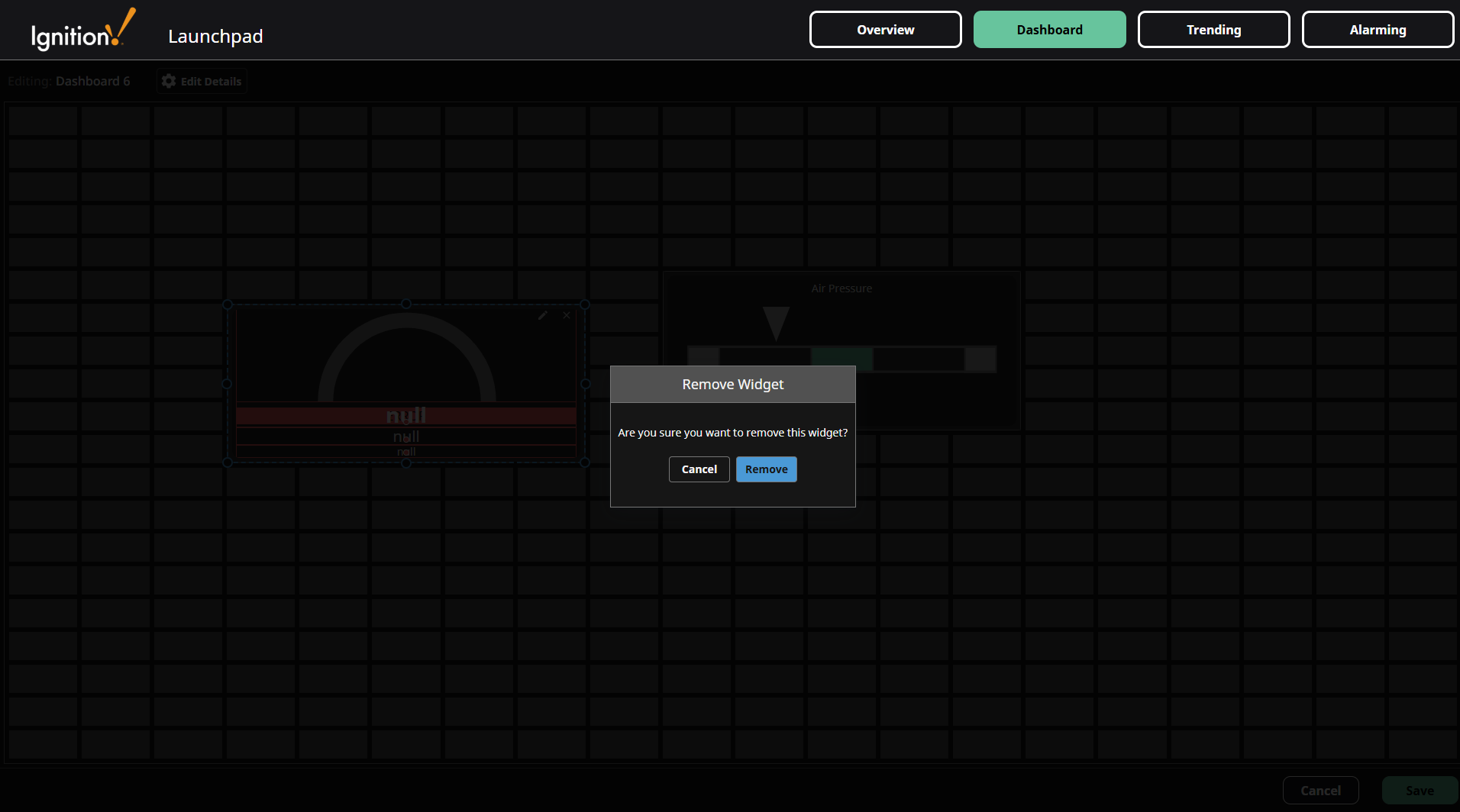
-
Confirm the widget deletion.
Mobile Breakpoint
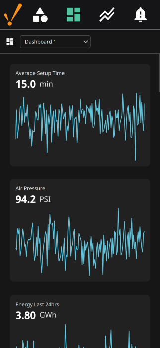
The Dashboard is mobile-responsive, so all components will automatically display in a single, scrollable column at screen widths below 1100 pixels by default.
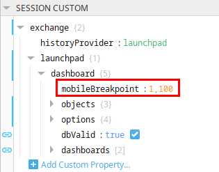
This breakpoint value is configurable in the Designer at session.custom.exchange.launchpad.dashboard.mobileBreakpoint.
Database Configuration
While the Dashboard component is capable of storing its configuration using any Ignition-supported storage mechanism, the Launchpad Dashboard's configuration is managed through the Launchpad database connection. For detailed information on the tables utilized for this configuration, refer to the Dashboard Database Tables page.